
Case studies — Deep cuts

Three fights,
in full.

Not a grid of logos. The brief, the thinking and the aftermath — exactly as they happened at Myndroot, the agency Nexa Studio was born from.

01

Beverages · 2026

Vairagi Beer

A monk walks into a bar.
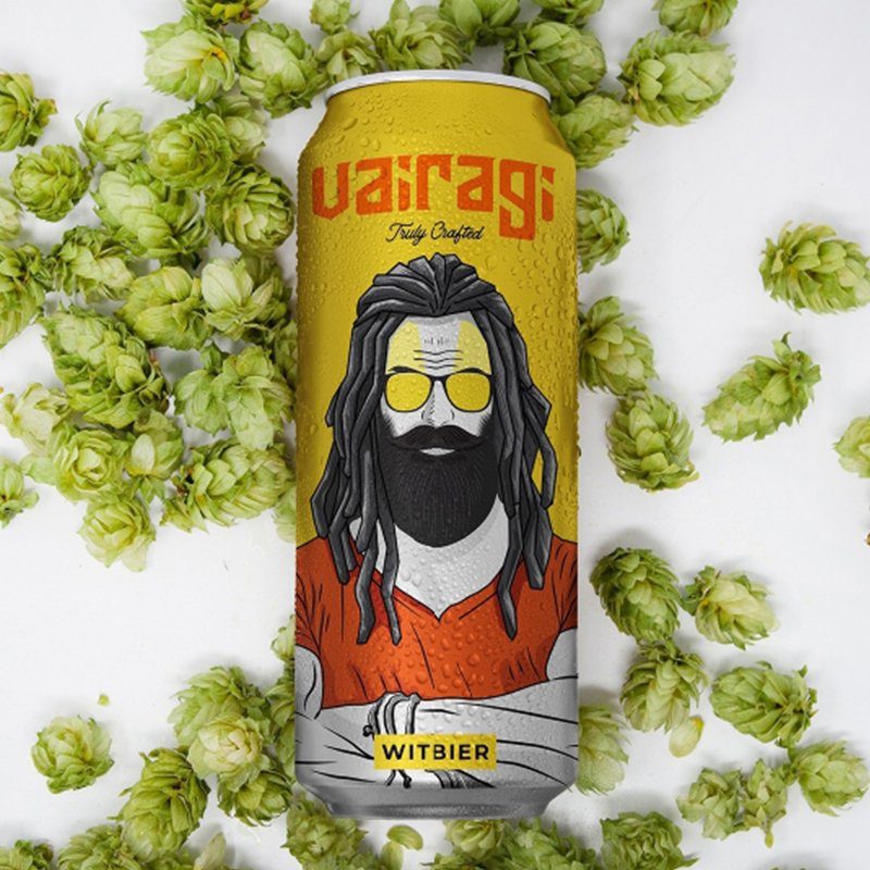
Vairagi Beer

The brief

India's craft beer shelf is crowded with loud labels saying nothing. Vairagi needed a brand world that could carry an unusual name — the ascetic — into the most hedonistic aisle in the store, without turning it into a joke or a lecture.

The move

We leaned into the tension instead of resolving it. The brand world was built on controlled contradiction: monastic restraint on the surface, sensory indulgence underneath. Identity, packaging and launch content were designed as one system, so the bottle, the feed and the bar told the same story.

The aftermath

A label people photograph before they drink. The launch carved out instant shelf recognition in a category where newcomers are usually invisible, and gave the brand a story bartenders could retell.

  • Brand identity & packaging
  • Launch campaign
  • Social media system
  • Photography & film
02

Jewellery · 2024

Jewelbox

Making heirlooms speak to the feed generation.

The brief

Jewellery in India is bought on trust built over generations. Jewelbox had the craft but not the conversation: younger buyers scroll past traditional jewellery advertising because it looks like their mother's newspaper.

The move

We rebuilt the brand's presence around intimacy instead of grandeur. Close crop photography, real skin, real light, copy that talks about moments rather than carats. The identity was tightened to let the product breathe, and campaigns were built as ongoing editorial rather than seasonal bursts.

The aftermath

A jewellery house that behaves like a modern editorial brand. Engagement stopped depending on festive spikes, and the brand earned a year round voice with the buyers it was built for next.

  • Brand identity refresh
  • Campaign platform
  • Editorial photography
  • Content system
03

Events · 2017

FIFA U-17 World Cup 2017

The world came to Kolkata. Kolkata had to look the part.

The brief

India's first FIFA tournament was not just a sporting event, it was a statement. Host city communication had to move a cricket obsessed city to fill football stadiums, across languages, demographics and attention spans, on a fixed deadline with zero room for drift.

The move

Campaign communication designed for the street first. High visibility outdoor, transit and public touchpoints backed by regional language messaging that made the tournament feel owned by the city rather than visiting it. Every asset was built to be read at speed.

The aftermath

The tournament drew record crowds for its tier and Kolkata's matches ran at capacity. The campaign became part of the city's visual memory of 2017, proof that the team could carry a world stage brief.

  • Campaign communication
  • Outdoor & transit media
  • Regional language adaptations
  • Event collateral

The fourth one is unwritten.

Bring us a market to guard and a number to move. We will bring the teeth.

Write it with us